What's the difference between saturation and vibrance adjustment?
Saturation increases all colors equally, which can cause over-saturation. Vibrance intelligently enhances muted colors while protecting skin tones and already-saturated colors from becoming unnatural.
Can I adjust individual color channels separately?
Yes! Our tool provides individual RGB channel controls, allowing you to adjust red, green, and blue channels separately for advanced color correction and creative effects.
How do I correct white balance and color temperature?
Use the color temperature slider to adjust from warm (orange) to cool (blue) tones, and the tint control for green/magenta balance. This corrects lighting conditions and creates the desired mood.
Are there preset adjustments for common photo problems?
Yes! We provide presets for common issues like underexposure, overexposure, color casts, and creative looks. These serve as starting points that you can further customize.
Will adjustments affect image quality or resolution?
No! All adjustments are non-destructive and maintain original image quality and resolution. You can make unlimited adjustments without any quality loss or compression artifacts.
How do I fix overexposed or underexposed photos?
For overexposed photos, reduce highlights, lower exposure, and increase shadows to recover details. For underexposed images, increase brightness, lift shadows, and adjust midtones. Use the histogram view to monitor tonal distribution and prevent clipping in highlights or shadows.
What's the difference between highlights and shadows adjustment?
Highlights control affects the brightest areas of your image without impacting dark regions, perfect for recovering blown-out skies or bright details. Shadows adjustment targets the darkest areas, lifting them to reveal hidden details while preserving bright areas. This selective adjustment maintains image contrast better than overall brightness changes.
How do I achieve professional color grading like in movies?
Movie-style color grading typically involves: 1) Correct white balance first; 2) Adjust contrast with highlights/shadows; 3) Create mood with color temperature (warm/cool); 4) Use selective color adjustments for orange/teal looks; 5) Fine-tune with RGB channels. Start with preset filters like 'Cinematic' or 'Film Look' as your foundation.
Can I correct color casts from different lighting sources?
Yes! Color casts are easily corrected with temperature and tint controls. For tungsten (orange cast), move temperature slider toward blue. For fluorescent (green cast), adjust tint toward magenta. For mixed lighting, use selective adjustments or correct for the dominant light source first.
What's the best workflow for portrait color correction?
Portrait workflow: 1) Set proper white balance using skin tones as reference; 2) Adjust overall exposure with brightness/contrast; 3) Use vibrance instead of saturation to protect skin; 4) Lift shadows gently to reveal detail; 5) Warm skin tones slightly with temperature if needed. Avoid over-saturation which makes skin look unnatural.
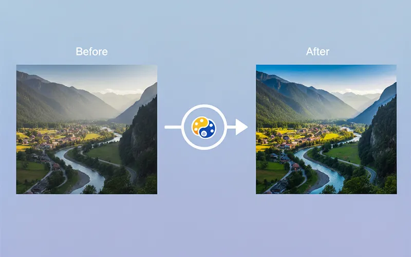
How do I enhance landscape photos effectively?
Landscape enhancement tips: 1) Increase vibrance to enhance natural colors; 2) Boost contrast with highlights/shadows for dramatic skies; 3) Enhance blues for water and sky; 4) Increase green saturation for foliage; 5) Use graduated adjustments for skies. Consider golden hour warmth or blue hour coolness for mood.
What are curves and how do they differ from basic adjustments?
Curves provide precise control over tonal relationships by adjusting specific luminance ranges. Unlike linear brightness/contrast, curves let you create S-curves for increased contrast, lift shadows while maintaining highlights, or create custom tonal mappings. They're essential for professional color grading and fine-tuning specific tonal ranges.
How do I match colors between multiple photos?
Color matching workflow: 1) Identify a reference image with desired colors; 2) Note its temperature, tint, and color balance settings; 3) Apply similar adjustments to other images; 4) Use RGB channel adjustments to fine-tune color relationships; 5) Save custom presets for consistent application across photo series. Lighting conditions should be similar for best results.
What's the science behind color perception and adjustment?
Human vision perceives colors through three channels (red, green, blue) similar to digital sensors. Color perception is relative - the same color appears different under various lighting conditions. Our adjustments compensate for these perceptual differences, ensuring colors appear natural regardless of viewing conditions. Understanding color temperature (measured in Kelvin) helps predict how adjustments will affect overall mood.
How do I prepare images for different output media?
Output preparation varies by medium: For web display, use sRGB color space and increase saturation slightly for screen viewing. For print, work in Adobe RGB, increase contrast 10-15%, and consider paper type (glossy vs matte). For social media, boost vibrance and contrast for mobile viewing. Always soft-proof when possible.
What's the relationship between gamma, contrast, and brightness?
Gamma affects the midtone curve without changing black/white points, useful for mood adjustment. Contrast adjusts the difference between light and dark areas, affecting overall punch. Brightness shifts all tonal values equally. For natural-looking adjustments, use gamma for mood, contrast for impact, and brightness for exposure correction.
How do I fix color banding and posterization?
Color banding occurs when there aren't enough tones between colors, often from over-adjustment. Prevention: Make gradual adjustments, work in higher bit depth when possible, avoid extreme saturation boosts. If banding appears, slightly increase noise/grain, use dithering techniques, or reduce the intensity of problematic adjustments.
What are split-toning techniques for creative effects?
Split-toning adds different colors to highlights and shadows independently, popular in modern photography. Typical combinations: warm highlights/cool shadows for summer vibes, orange highlights/teal shadows for cinematic looks, or subtle gold highlights/blue shadows for elegant portraits. Start with low saturation and build up gradually.
How do I maintain skin tone accuracy in mixed lighting?
Skin tone preservation in mixed lighting: 1) Set white balance for the primary light on skin; 2) Use selective color adjustments to fine-tune; 3) Protect orange/red channels which represent skin; 4) Avoid over-saturation which creates unnatural skin; 5) Use vibrance over saturation for safer enhancement. Reference memory colors - people notice skin tone inaccuracies immediately.
What are the principles of color harmony in image adjustment?
Color harmony principles: Complementary colors (opposite on color wheel) create tension and drama. Analogous colors (adjacent) provide harmony and calm. Triadic schemes use three evenly spaced colors for vibrant yet balanced looks. Monochromatic uses variations of single hue for elegance. Consider these relationships when making creative color adjustments.
How do I adjust images shot in RAW vs JPEG format?
RAW files have more adjustment latitude - you can recover highlights/shadows more aggressively and make larger color corrections without artifacts. JPEG files have limited adjustment range due to compression and processing already applied. For JPEGs, make smaller, more gradual adjustments and be careful with highlight recovery.
What's the impact of monitor calibration on color adjustment?
Monitor calibration is crucial for accurate color work. Uncalibrated monitors may display colors incorrectly, leading to poor adjustment decisions. Calibrate to D65 white point, 2.2 gamma, and 120 cd/m² brightness for standard work. If calibration isn't possible, use standard conditions: moderate room lighting, neutral background, and compare with reference images.
How do I create vintage and retro color effects?
Vintage effects typically involve: 1) Slightly lifted blacks for that 'faded film' look; 2) Reduced contrast for softer appearance; 3) Color grading toward warm tones (orange/yellow); 4) Slightly desaturated overall; 5) Split-toning with warm highlights/cool shadows. Different eras have distinct looks - 70s warm/orange, 80s cool/cyan, 90s high contrast.
What are selective color adjustments and when to use them?
Selective color adjustments target specific color ranges without affecting others. Useful for: enhancing blue skies without affecting skin, boosting green foliage while preserving other colors, correcting specific color casts, or creative color isolation effects. More precise than global adjustments but requires understanding of color relationships and potential side effects.